Technology
Analysis and Visualization of People Flow
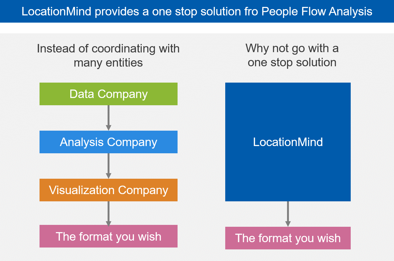
LocationMind provides a one-stop solution for People Flow Analysis
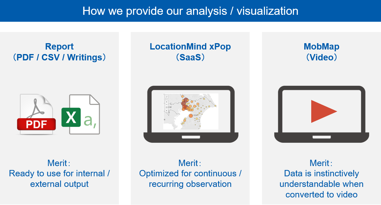
We provide a variety of solutions for analysis and visualization requests.
- Reports
- Case study reports in which we provide our analysis and visualization as a repository for regular PDFs, web content, etc.
- Dashboard
- Using the ‘LocationMind xPop’as a SaaS product that can rigorously and continuously observe fixed points with fixed specifications as well as display the chronological results in the form of a dashboard.
- MobMap
- A tool that visualizes people flow data chronologically and intuitively, and creates a video output. We use MobMap to provide video-based data from us. MobMap services can also be used as a video product, and you may also customize it the way you want to visualize.
Analysis output
Our teams are developing new indicators that combine not only typical datasets such as daytime population and nighttime population and inter-regional movement (Inflow-Outflow, Origin-Destination, etc.), but also develop new indicators combining human flow and non-human flow data for comprehensive and efficient analysis. Some of these indicators are being developed from time to time, while others are newly added to the dashboard menu at your request.
Examples of Analysis from LocationMind
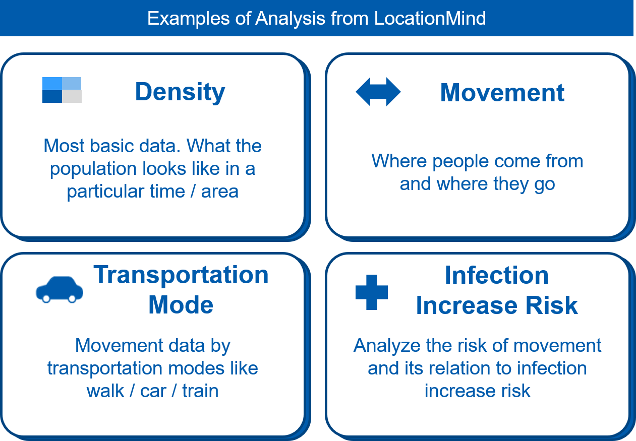
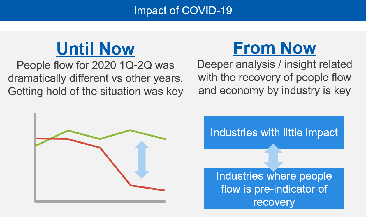
We are currently receiving inquiries from government agencies, local governments, and private companies regarding human flow under the influence of COVID-19 (new coronavirus). We will continue to provide a variety of human flow analysis so that society and the economy can return to their original conditions. We believe that correct visualizations of human movements would necessarily demonstrate why it is crucial to reduce the movement and refrain from going out unnecessarily.
COVID-19
Impacts of COVID-19
Examples of analysis and visualization
- Examples of Mitsubishi Research Institute Corporation
-
・The new Coronavirus Flow Analysis Report 1: Understanding Nationwide inter-prefecture Migration during Golden-Week Vacations(新型コロナウイルス人流分析レポート1:都道府県に着目したGWにおける全国移動の把握)
・The new Coronavirus Flow Analysis Report 2: A comparative analysis in a year by year analysis of movement during the Weekdays of late April 2020 shows that mobility was reduced from 1-20%. During the same time movement by trains has halved. (新型コロナウイルス人流分析レポート2:4月後半の平日の移動は対前年比で自動車は1~2割減、鉄道はほぼ半減)
- A case study of the new Coronavirus infectious disease control page (corona.go.jp) developed by the Cabinet Secretariat
Please contact us if any of these keywords interests you:
- Visualization of people-flow data for typical daytime population, nighttime population, and inter-regional movement.
- Analyze and visualize
the human flow data
in a company - Development and visualization of indicators that combine the with human flow data within a company.
- Interested in Web Dashboard
with LocationMind xPop - Interested in video visualization
using MobMap